Missed a newsletter? Find'em here...
Below you find all issues of The Finance Alchemist's Transformation Scroll.
This is a weekly newsletter with hands-on tips, tricks and insights on how to streamline your data tasks as a finance professional.
And if you like a little bit of Nerd Stuff (as in Dungeons & Dragons) - there is something in store for you as well.
The Finance Alchemist's Transformation Scroll
Data Visualization in KNIME
read time 7 minutes
Salutations, Fellow Alchemists,
New week, new scroll! Today, we’re diving deep into the enchanted waters of Data Visualization with KNIME. Ever wondered how to turn those boring numbers into a magical visual story? Well, wonder no more!
Let the transformation begin!

Scroll's Prologue
In the ancient times, data was just… numbers. But as the alchemists of old discovered, there’s magic in everything, even in those numbers. By visualizing data, we can see patterns, trends, and stories that were once hidden. And with KNIME, this becomes as easy as waving a wand.
THE REWARDS:
KNIME Rune
The Enchanted Bar Chart
This KNIME rune empowers you to transform mundane data columns into captivating bar charts.
Powers of the rune:
Witness its enchantment:
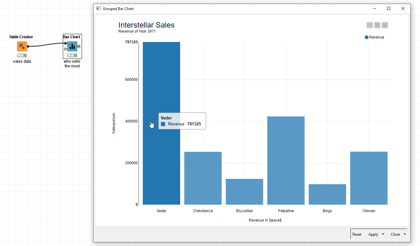
Link to the workflow (free on my KNIME Hub): https://hub.knime.com/-/spaces/-/latest/~7LY0Fy4lQrodZHHq/
RUNE INSIGHTS
KNIME Charm
The Mystical Pie Chart
The Circle of Data
Pie charts are like the cauldrons of data visualization. Pour in your data, stir, and watch it transform into a visual delight.
Slices of Insight
Each slice represents a category, and its size tells you its significance. But remember, a pie chart is best used when you have limited categories. Too many slices and your pie might just crumble!
The Magic Touch
With KNIME, you can add interactive legends, labels, and even animations. Make your pie dance to your tunes!
HOW IT AMPLIFIES THE SPELL:
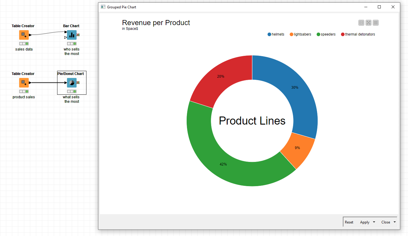
Link to the workflow (free on my KNIME Hub): https://hub.knime.com/-/spaces/-/latest/~7LY0Fy4lQrodZHHq/

KNIME Talisman
The Power of Color
The Spectrum of Emotions
Colors evoke emotions. Use them wisely in your visualizations to set the mood and highlight what’s important.
The KNIME Palette
KNIME offers a wide range of color palettes. Whether you want a gradient or contrasting colors, KNIME has got you covered.
Color Consistency
Ensure you use consistent colors across different visualizations for the same categories. It makes your story flow better and reduces confusion.
TALISMAN TRAITS
Scroll's Epilogue

Your Journey Today
Until the next scroll unravels,
Yours Truly,

PS: Video Introduction to KNIME: https://youtu.be/ogqwRmP5kLo
PPS: Today's workflow (free): https://hub.knime.com/-/spaces/-/latest/~7LY0Fy4lQrodZHHq/

